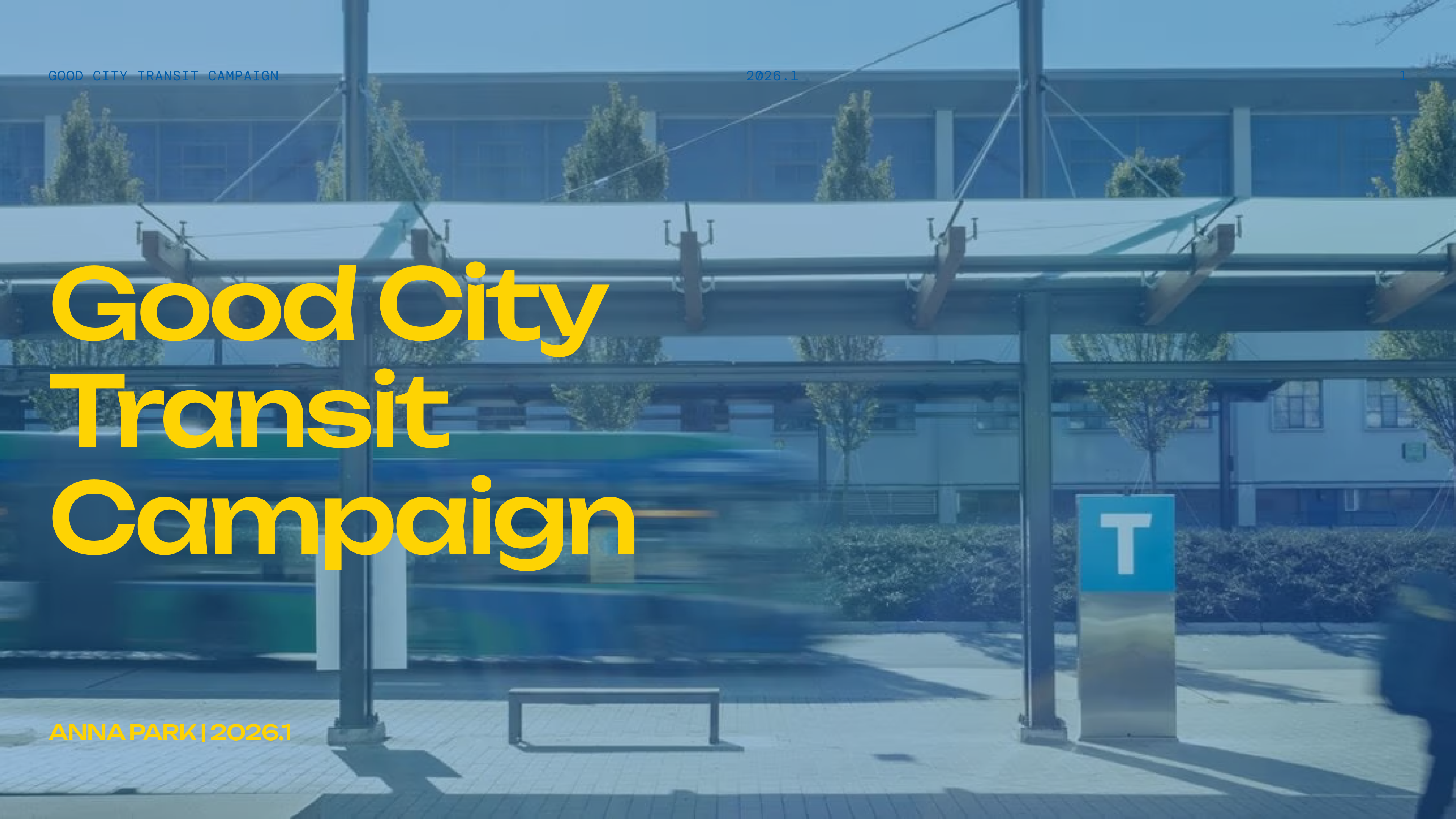
Good City Transit Campaign
Redesign client's Personal Newsletter page
Timeline
Jan 2026
Team
Personal
Role
Visual Branding
Skills
Visual Branding, Visual Identity

Long story short
Designed Good City Transit Campaign
Public transit is a shared space. How we behave shapes the city we live in. Good City Transit explores everyday manners and small actions that create a more respectful, shared urban experience.
The color palette is inspired by vivid public colors commonly used in shared environments.
Noise texture introduces a retro and contemporary aesthetic.
Mindmap
Summary
Five keywords came to my mind. And, I got more inspiration from Public and Vancouver. Instead of using new colors, I wanted to focus on respsect and public space first.

Research Board

Logo Development
Sketch
I started by thinking about icons from the word "Goods" and "City". And then I sketched ideas on my iPad. Then, when I looked at the SkyTrain map, I wanted to use the dot from the map.

Inspiration
